Aion Infinit brings 10 years of expertise in digital marketing, IT recruitment, and web development. We deliver tailored solutions that drive growth and maximize results.
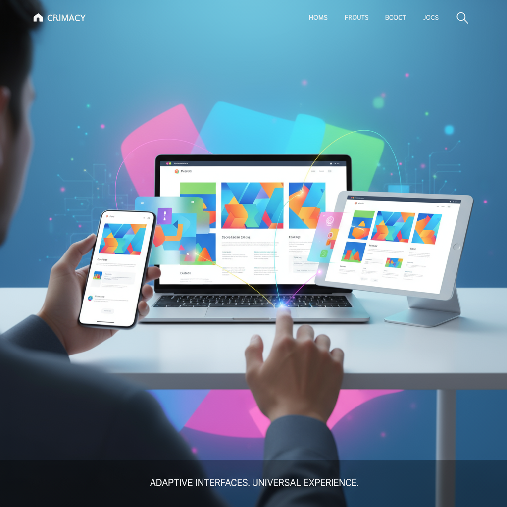
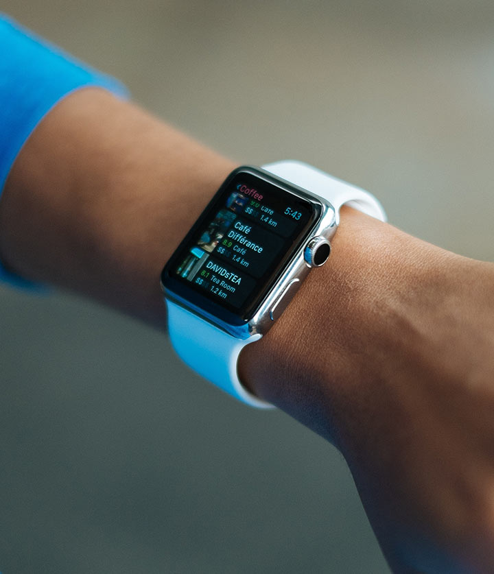
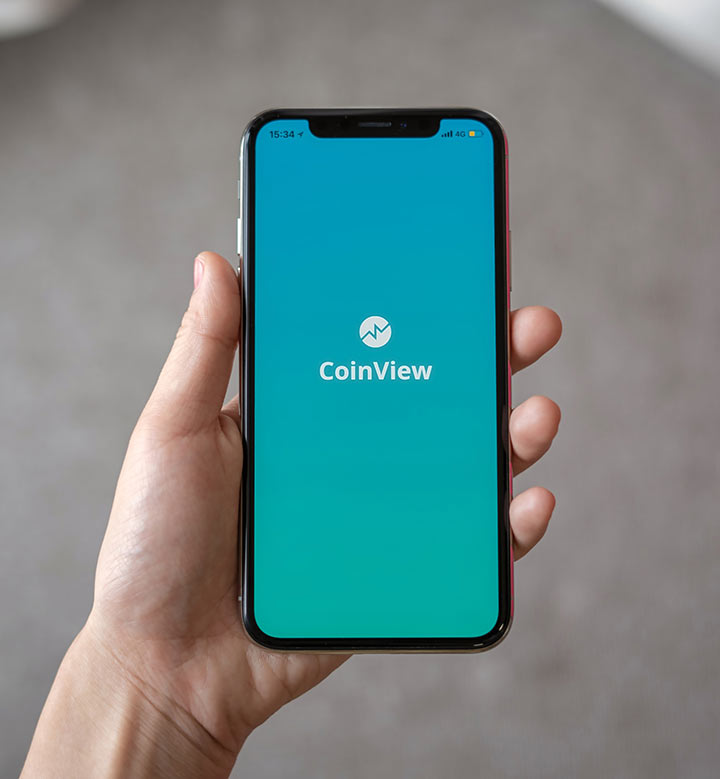
Ensure your website delivers a flawless viewing experience on any device by using responsive web design techniques. This approach adapts your site’s layout, images, and content dynamically to fit different screen sizes, whether desktops, tablets, or smartphones. By employing flexible grid systems, scalable images, and CSS media queries, the website automatically resizes and rearranges elements to maintain readability and usability without the need for zooming or horizontal scrolling. Navigation menus transform into touch-friendly formats like hamburger icons on smaller screens, improving accessibility. Responsive design also prioritizes load speed by optimizing images and content for mobile performance, reducing bounce rates and improving user satisfaction. Ultimately, this creates a consistent, inviting experience that encourages users to stay longer, interact more, and trust your brand across all platforms.
Responsive Design
Responsive Design1
Responsive Design2
Responsive Design3
How It Works
Responsive design uses flexible layouts, images, and CSS media queries to automatically adjust the website’s appearance based on the screen size and device type, delivering a consistent user experience.
Process
Analyze target devices and user behavior to inform design decisions.
Create flexible grid layouts and scalable images that adapt to various screen sizes.
Implement CSS media queries to modify styles for different devices dynamically.
Test website performance and usability on multiple devices and browsers.
Optimize load times and touch interactions for mobile users.
Results
A visually appealing, fast-loading website that enhances user engagement, lowers bounce rates, and improves SEO rankings by catering to diverse device users seamlessly.